Pitching Change Decision Making Score 2025: Offseason Updates and Early Season Insights
- Sean
- May 27, 2025
- 12 min read
Updated: May 28, 2025
The 2025 MLB regular season is well underway and I’ve finally caught up on the to-do list that I made for myself for what I wanted to do over the offseason for my Pitching Change Decision Making Score (PCDMS) project. If this is the first time you’re hearing about PCDMS, then I encourage you to check out the introduction post and the accompanying dashboard that I have for sharing the results and insights with you all. I will warn you, the introduction post is quite dense and is meant to serve as a reference for anyone who further explores the topic in the future. But if you’re okay with a Too Long Didn’t Read (TLDR) version, PCDMS is a framework for evaluating pitching change decisions made by MLB teams and places an emphasis on process over outcome.
With that out of the way, let’s quickly touch on the main elements of this blog post:
Offseason Task #1: Model Updates! I spent the offseason making some slight tweaks to each of the models and was focused on introducing variables that captured how “rested” a pitcher was at the time of evaluation. I’ll go into detail on my approach and what I ended up doing.
Offseason Task #2: “Should the pitcher have been removed?”. I spent the offseason exploring various approaches to this question with the intention of integrating it into the evaluation framework. I’ll go into a bit more detail on what I explored and what I decided to do.
Offseason Task #3: Evaluating metric stability and predictiveness. It’s common to evaluate metrics for each of these elements, so I’ll be going into more detail on this as well.
2025 Regular Season First Third Update. With the season just about 33% of the way through, let’s take a look at the current laggers and leaders.
Alright, let’s get into it.
Offseason Task #1: Model Updates
When I first shared the project back in September 2024, I was asked by someone on twitter if I accounted for “rest” in my approach. They cited an example of generally having a preference for using Edwin Diaz in favor of Jose Butto, but what about Diaz on a third straight day of pitching versus a well rested Butto. Despite it being a consideration during the development process, it was something I had elected to address with future iterations and became a point of focus for any updates I made going into the 2025 season.
Going into my investigation, my hypothesis was that there would be a noticeable and perhaps even a significant difference in pitchers’ performance when evaluating their performance through the lens of how rested they were. My initial hypothesis, without looking at the data, was that generally, the more rested the pitcher is, the better they perform. Luckily, I had a previous post on FanGraphs from John Bollman that I could look to for inspiration. In this post, Bollman looked at starting pitchers’ performance and sought to understand whether the number of rest days between starts affects starting pitchers’ performance. Bollman found that when grouping rest days together (short rest, normal rest, extended rest), that there was not a significant difference. However, when comparing pairs of rest days, there were observations of statistically significant differences.
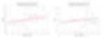
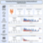
I decided to replicate Bollman’s analysis but only for relief pitchers and used On Base Percentage (OBP) Against as my primary metric. Additionally, I was more interested in understanding the difference between pairs of days of rest and less so of the difference after grouping days of rest together. I looked at data from the 2019 - 2024 seasons and using a two-proportion z-test, found that primarily, the main differences are observed when comparing pitchers on one day of rest versus those with three or four days of rest. If you only look at the OBP Against for the first four days, you observe a slow, progressive decline in the metric, but once five days of rest is reached, the trend no longer holds. To be honest, I’m not quite sure what to make of this dynamic other than naively suggesting that perhaps we see some survivorship bias at play where more skilled pitchers pitch more frequently - which comes with having less days between outings. This would be the opposite for the less skilled pitchers, who would hypothetically tend to pitch less frequently - which would come with having more days between outings. To help illustrate what I mean, I don’t think one could expect a pitcher on two days of rest to outperform a pitcher on five days of rest simply because the table below tells us this. Instead, any difference in performance is more attributable to the pitchers as well as the specific batter and pitcher matchups.

Relief Pitcher OBP Against Broken Out by Days Since Last Pitched (2019-2024)

To wrap this up, there is a significant difference in performance when comparing relief pitchers on one day of rest versus three or four, but other than that, no other pairwise comparisons seem to provide much insight. With this information in hand, I was curious if I could engineer features that would allow for my models to capture some of this dynamic. I went about engineering features for my models that captured the number of days since a pitcher last pitched as well as the number of pitches thrown in their last outing. I also created features for the number of days pitched in the last N days as well as number of pitches thrown in the last N days. To no surprise, I ultimately found that these features did not improve my models’ performance and nor did they impact the predictions of my models. In an effort to keep it simple and not just throw features into my models, I ultimately decided to not include them. Thus, this current iteration of my framework does not explicitly account for how rested a pitcher is when evaluating them for a pitching change decision. All of this isn’t to say that rest doesn’t matter when considering which relief pitcher to use. Instead, I feel like it would be wise to evaluate at an individual pitcher level and also consider any significant differences in pitch flight metrics from their most previous outings versus a baseline (i.e. have they experienced a decline in velocity).
Offseason Task #2: Investigating "Should They Have Been Removed?"
Another area that I wanted to look into this past offseason was “should the pitcher have been removed?”. I felt that I had a pretty solid approach to the “okay, you made the change, but was it a good process?”, so this felt like an obvious next step for me to investigate. Deciding how to evaluate this question was quite difficult given the open ended nature of it. I ultimately decided to break it down into two components: the pitcher’s performance up to the point of removal and the pitcher’s stamina up to the point of removal. For a pitcher’s performance, I looked at their running total run expectancy (using RE24 values). For stamina, I compared changes in pitchers’ velocity, spin rate, and release point (using Euclidean distance) for subsequent batters faced groups against the first three (for starting pitchers) or two (for relief pitchers) batters faced. It was an imperfect way of evaluating changes throughout a game, as pitch mix could affect cohort comparisons, but over the course of an outing, especially for starting pitchers, it could showcase any declines in these stamina indicators.
My ultimate idea was to use these features and model winning percentage with the thought being that when only looking at shifts in winning percentage for plate appearance matchups a given pitcher participated in, I could look at the change in winning percentage and get its slope to understand the general trend and impact a pitcher was having on the game. For example, if Tarik Skubal was dealing and had a positive WP Delta slope in the 90th percentile, then we perhaps would say that when only looking at the perspective as to how well the pitcher is performing up to this point, there wasn’t reason for removal. The problem was that there were a few issues with this approach. One was there while there was a relationship between a player's running total of RE and winning, there were not strong relationships between declines in stamina indicators (velocity, spin rate, and release point) and winning. Another was that I ultimately came to feel like I was trying to fit a square peg through a round hole. I did not need to come up with some noisy way of determining “should” a pitcher have been removed.
I ended up scraping this idea as a new element for the evaluation framework but did decide to incorporate it into the dashboard. Now, for each pitcher in a game, you can go and see a win probability chart, their running RE24 total, and their velocity, spin rate, and release point retention. The win probability comes from my own models and it’s well calibrated, but still a bit noisy when shifting at a granular game state level. Additionally, I am including the slopes of the line charts which give a more definite reading into how a pitcher’s performance or stamina indicators were trending. I think that it is a fantastic compliment to the Pitching Change Scorecard tab and can offer insight into what drove an element of a team’s decision making.

Offseason Task #3: PCDMS Stability and Predictiveness
Something that should be done for any metric created is to evaluate its stability and predictiveness. For stability, we care about this because we want to know if it remains consistent, at a team (or if getting more granular, at a manager) level year over year. This helps us understand if a metric like PCDMS is reliable. For predictiveness, we care about this because we want to understand if a team’s PCDMS from the prior year can help predict their metric for the following year. With 2024 well in the rear view mirror, I was able to perform this evaluation for PCDMS by comparing team level data for 2023 and 2024.
What I found was that it was not stable and nor was it predictive. The Pearson correlation coefficient was -0.113, which indicates a negative, weak relationship. The r-squared was 0.013, which tells us that only about 1.3% of a team’s PCDMS rating in 2024 was explained by their PCDMS in 2023. I have to admit that I thought that the metric would be more stable and predictive and that this forced me to re-evaluate what PCDMS tells us. To help do this, I revisited a comparative analysis that I did last fall and expanded it to include a new metric. So, I compared a team’s PCDMS metric to their overall winning percentage, their bullpen ERA, and their pitching roster’s stability. To calculate roster stability, I essentially compared how similar a team’s pitching staff (starters and relievers) was for a given game day to each of the other game days and used Jaccard Similarity to determine how similar the rosters were over the course of a season.

When evaluating the relationship between PCDMS and Winning Percentage for 2023 and 2024, we observe a positive, weak relationship with a Pearson correlation coefficient around 0.2. Additionally, the r-squared value was between 0.029 and 0.048 for each of the two years. 2023 saw a more strong relationship than 2024 did. This passes the sniff test, as better in-game decision-making should contribute positively to team success, even if it's only one of many factors driving performance.
When doing the same for a team’s bullpen ERA, we observe a negative, weak to moderate relationship with Pearson correlation coefficients of -0.411 in 2023 and -0.210 in 2024. Additionally, the r-squared value was at 0.169 in 2023 but fell to 0.044 in 2024. This relationship also passes the sniff test as teams who have a good process when making pitching changes tend to select pitchers who perform better at limiting runs.

Lastly, when doing the same for roster similarity, in 2023 the Pearson correlation coefficient was 0.441 which indicated a positive, moderate relationship and the r-squared was 0.195. Looking at 2024, this relationship was no longer present as the Pearson correlation coefficient was -0.017 and the r-squared was 0. This shift was fascinating and perhaps some of this can be credited to an increase in average roster similarity from 0.492 in 2023 to 0.559 in 2024. With less variation between teams in roster consistency, the signal may have weakened. The relationship observed in 2023 would suggest that the more similar the pitching roster, the better a team is at making decisions in regard to pitching changes. This seems to make sense to me given that the more stable a roster is, the better a manager or team can learn which situations best suit their players and deploy them effectively However, as already noted, this did not hold in 2024. I will certainly be circling back to this comparison at the conclusion of the 2025 season to see what, if anything, has changed.

I also wanted to break out the team level PCDMS stability and predictiveness analysis by teams who replaced their managers going into the 2024 season and those who did not. There were eight teams that made changes to their manager position ahead of the 2024 season and those teams did not see a meaningful improvement or decline in PCDMS from 2023. The teams with the same managers reflected a slightly stronger, but still weak, negative correlation and not much predictiveness - which is in line with the overall trend already discussed.
The last cut that I looked into was evaluating the relationship, at a team level, between the change in PCDMS from 2023 to 2024 and the change in pitching roster stability from 2023 to 2024. This showed a positive, weak Pearson correlation coefficient of 0.188 and an r-squared of 0.035. This tells us that generally, as a team’s pitching roster gained in stability, their PCDMS also improved. This seems to point back to a discussion point earlier that the more stable a team’s pitching staff, the better process a team can exhibit when it comes to pitching change decisions. Granted, it’s not a bonafide strong relationship, so it clearly does not tell the whole story.
Generally speaking, PCDMS at a team level is not stable. Its relationship with winning percentage and bullpen ERA were similar year to year but we observed a large shift in the relationship between PCDMS and pitching roster similarity. When comparing the strength of relationships between metrics, we widely see a decline in 2024 when compared to 2023. From this evaluation, I have a few thoughts. I am surprised to see PCDMS not be more stable or predictive at a team level. To me, this is telling me that the way my framework grades decisions doesn’t necessarily capture the “skill” of a given manager or team in regard to their decision making. I still stand by the framework being a sound and reasonable method for decision evaluation given the inclusion of situational context (leverage at the time of the pitching change and matchup considerations). It not having a stronger association with team success like winning percentage isn’t a surprise given the variance of baseball and that a lot more goes into the outcome of a baseball game than pitching change decisions. So, I think that I land on PCDMS being most effective as a descriptive, in-season tool for contextual analysis of a manager’s or team’s decision making rather than something that explicitly captures or measures a manager’s broader decision making skill set. Simply put, it can be used for evaluating decisions within a specific season and should not be used across seasons.
33% of the Way There Update:
As of games through May 22, 2025, the New York Mets are the current leaders in PCDMS with an overall grade of 120.7. Closely following the Mets are the San Francisco Giants at 119.6, the Minnesota Twins at 116.7, and the Seattle Mariners at 114.9. Down at the bottom of the standings are the Colorado Rockies with an overall grade of 68.2, the Baltimore Orioles at 82.7, the Cincinnati Reds at 85.0, and the Milwaukee Brewers at 89.0.
Diving into a little more detail on the Mets, the framework favors much of what they decide to do, regardless of the breakout! When considering the pitcher chosen to enter the game compared to the pitcher they are replacing, the framework agrees with about 68% of their decisions. Their component grade of 121.2 is good for third in MLB and is largely driven by their decision making during High (79%) and Very High (74%) leverage situations. When breaking their decisions out by comparing the pitcher chosen to those available in the bullpen, both for during the three batter minimum rule and after, we observe similar patterns of high agreement rates at High and Very High leverage situations - which helps drive their high grades of 119.7 and 121.0.
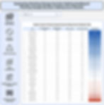
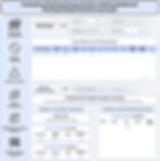
When looking at who manager Carlos Mendoza and the Mets deploy, the framework is mostly favoring when they use pitchers like Reed Garrett, Ryne Stanek, Huascar Brazoban, Edwin Diaz, and Jose Butto. It certainly doesn’t hurt for Mendoza when he has a very talented group of pitchers to choose from! If you’re curious what some of his decisions look like, a good way to get a better understanding is to dive into the Pitching Change Decision Scorecard tab in the dashboard. Below is a screenshot of the pitching change from the Mets at Yankees on May 17, 2025 when Edwin Diaz replaced Reed Garrett. It was a high leverage situation where the Mets had a one run lead in the bottom of the 9th inning with Austin Wells, Ben Rice, and Aaron Judge up to bat. The framework ultimately agreed with this decision and luckily for the Mets, the outcome aligned with the process and they held onto the win!
Final Housekeeping
Moving forward, my plan is to have the dashboard updated a few times a week. So, be on the lookout for that on Twitter at my personal twitter account. I also plan on doing a deep dive into the decision making of the Chicago White Sox new manager, Will Venable. Stay tuned for that one, especially if you’re a White Sox fan!
In general, if you have thoughts, questions, or feedback, please do not hesitate to reach out!
Image License Information:
Boone: This file is licensed under the Creative Commons Attribution-Share Alike 2.0 Generic license. Changes were made to hat and sweatshirt, alongside photo edit retouches
Hinch: This file is licensed under the Creative Commons Attribution-Share Alike 4.0 International license. Changes were made to hat and sweatshirt, alongside photo edit retouches
Roberts: image under public domain because it was taken by the US Air Force, so no license needed